What the 2020 presidential candidates’ logos tell us, explained by design experts
What the 2020 presidential candidates’ logos tell us, explained by design experts
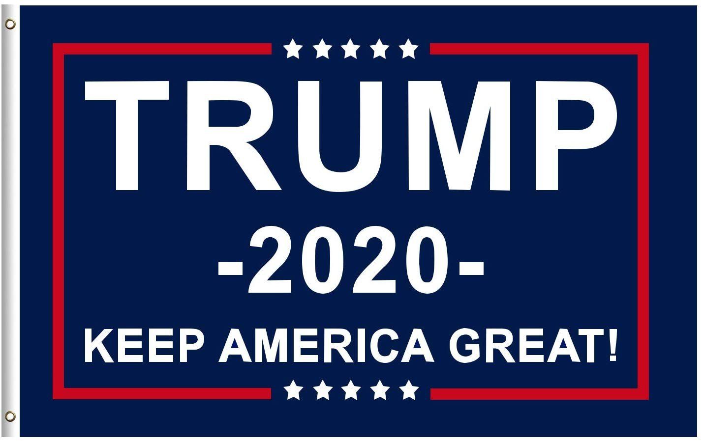
What is it about a political candidate’s logo that makes people want to get out and vote? Did Alexandria Ocasio-Cortez’s dynamic branding — incorporating speech bubbles and stars, her name pitched at an angle — particularly speak to voters in Queens and the Bronx last November? Was it President Donald Trump’s heavy sans serif logo, rendered in navy and red, that Americans found so compelling in 2016?
Voters might not necessarily realize it, but graphic design plays an important role in political campaigns, alerting us to how a candidate wishes to be perceived by the public. The growing field of entrants to the 2020 presidential race has already introduced a wide array of visual styles, from Kamala Harris’s striking purple, yellow, and red color scheme and Elizabeth Warren’s upbeat but simple sans serifs to Jay Inslee’s environmentalist iconography. New entrants include Pete Buttigieg’s blocky bridge logo and Joe Biden’s bold use of “President” in his imagery.
Source: Vox.com


